October / November 2016
Cubes - Pattern & Form
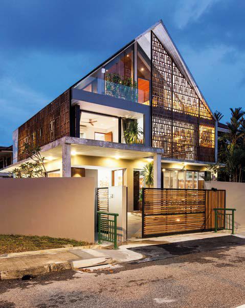
Occasionally you come across a project that stops you in your tracks. This house is such a project. Located beside a bus stop and nestled into a major-minor road intersection in Singapore’s eastern suburbs, the house commands attention with a predominant use of concrete in an elegantly brutal and simple manner. The concrete is laced with filigreed, patterned timber screens that hold an ambiguous resemblance to East Asian and Islamic motifs. This is a house that confronts its context by challenging the orthodoxies of what is expected within a typical suburban streetscape.
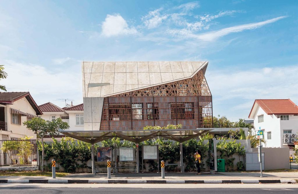
“The clients had not stayed in this region of Singapore before, but there was a certain charm about the district that led them to buy this plot of land,” shares Aamer Taher, Principal and founder of Aamer Architects. He proceeds to direct our view to the two-storey post-war terrace houses across the road and explains: “When our clients appointed us to design their new house, the condition and structure of the original house looked similar to those neighbours. A new build would have required frontal setbacks from both roads that flank the site. That would have greatly reduced the footprint of the house, [making it difficult] to accommodate the necessary spaces. Eventually, we chose to reconstruct the existing house by keeping the existing columns and a single setback, working the plan around this and shielding the interior with a new roof as a means of sculpting the building and giving it a new form.”
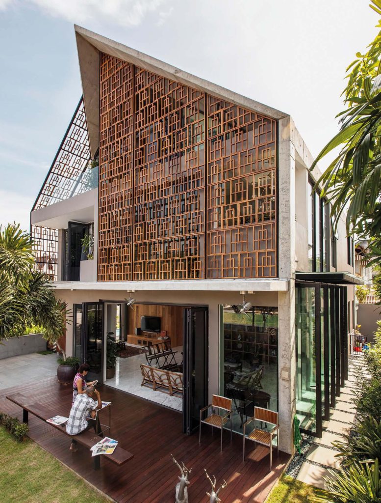
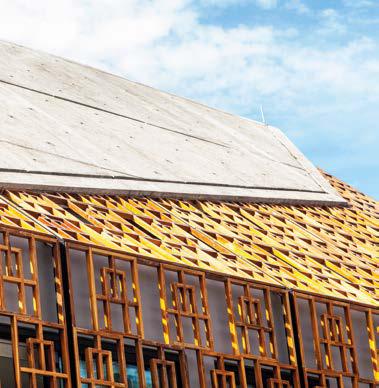
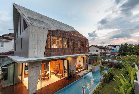
The palpable aesthetic determination led Taher and his Associate Ryan Kim to choose concrete as the new roofing material due to its inherent plasticity and robustness. These qualities made it easier for the form to be calibrated and voids to be strategically opened up, allowing views and light to enter the house. The concrete skin was further developed by making the roof similar to the walls. As Kim shares, “By allowing the form to touch the ground, the roof is given parity with the walls. This blurs the distinction between the two elements.”
The pervasive sense of honesty in construction that this instils belies the duo’s highly disciplined and committed structural approach. As Taher reveals, “This was our first time working with off-form concrete to such an extent, and it was the contractor’s first time using the material. That meant rounds of discussion and review before we managed to get the raw state of the concrete to look acceptable for the clients to live in. We went down to the details of designing the groove lines to conceal the lighting conductor on the roof.”
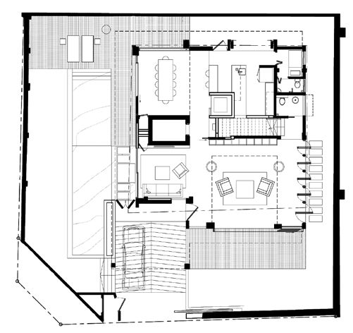
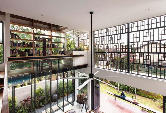
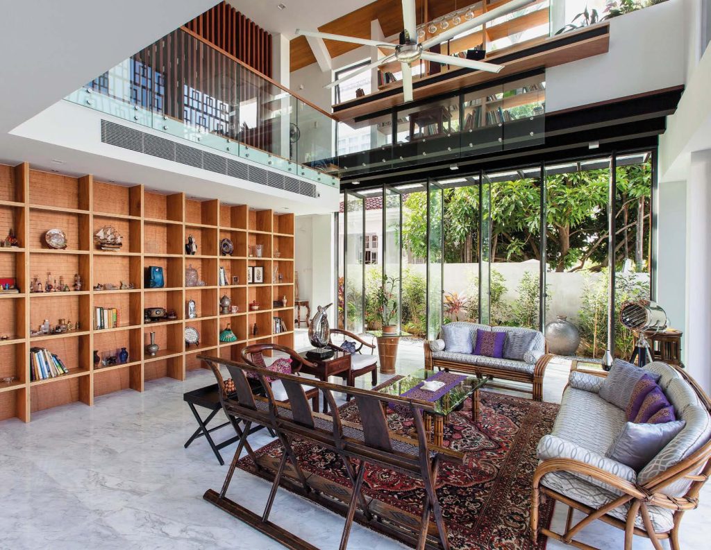
While the concrete may appear tough and raw on the exterior, the interior is firmly grounded in the pleasures of living. Stepping into the house, I find the grand double-volume living room to be surprisingly serene. There is a secondary living area attached that functions as a salon. All the entertainment areas, including the dining and kitchen at ground level, blend easily with the outdoor decks and overlook the swimming pool and lush greenery. Trickling sounds from the poolside water feature, verdant landscaping and thicker-than-usual solid boundary walls were all intentionally designed to act as a sound buffer to mitigate traffic noise from the main road, while providing a visual relief to pedestrians and road users on the other side.
Internally, timber is used as a primary material and the interior finishes glow with a warm, earthy palette that accentuates the clients’ unique collection of antique furniture. The living room is surrounded by a mezzanine floor where a study and library has been located “to allow for a commanding view of the house, internally and externally,” shares Taher.
Apart from its form and finishes, the architecture intrigues with a few unexpected features. It is interesting to note that although the library faces the eastern sun, the walls here have been replaced with large panels of fixed glass for views out. Comfort is not compromised, however; full-height plywood shelves and timber screens have been designed to shield the interior from glare. A frameless casement window has also been subtly positioned at the adjacent planter box to allow passive cooling to take place.
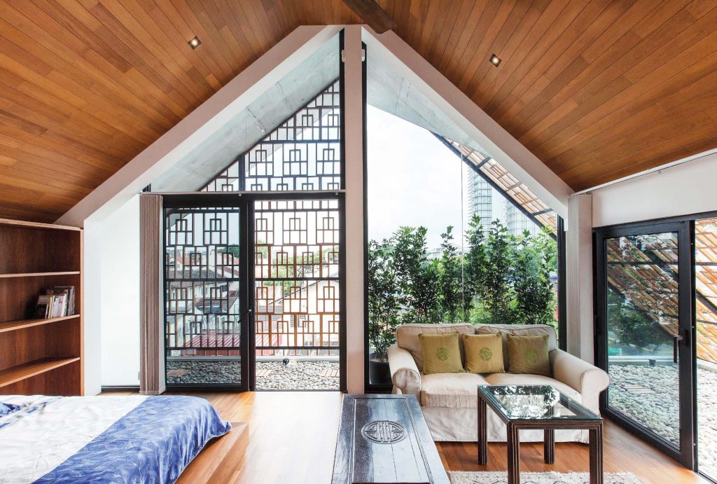
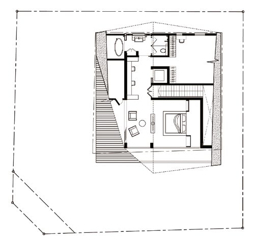
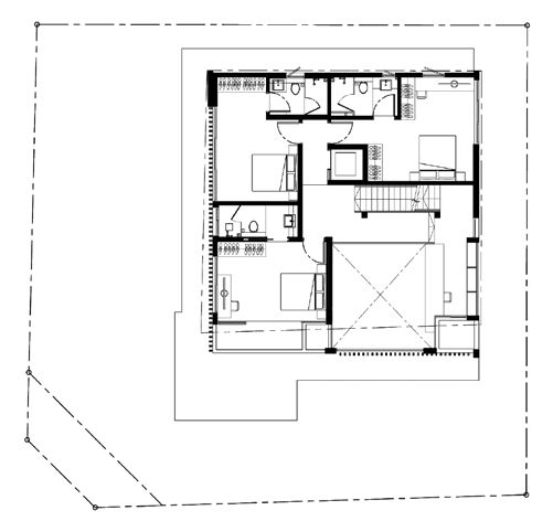
While most houses would typically increase the presence of walls in private spaces, the walls in this house tend to disappear on the upper floors to reveal the surrounding views from the bedrooms. The theme of openness and sculptural composition is at its pinnacle in the master bedroom. Located in the attic, it enjoys the comfort of deep overhangs, plenty of natural light and long distant views of the surrounding streetscape and suburban environment. Here, the handcrafted teak screens are once again used to create differing levels of privacy – a result of Kim’s dedicated study of proportions to determine the perfect geometry and gap size for form and function to co-exist. Both Taher and Kim agree that this is their favourite spot in the house, and I couldn’t agree more.
Despite twentieth-century attempts to purge modern architecture of ornament, the case remains that a judicious use of pattern reveals its capacity to be functional, multivalent and rich. There is no indulgence here, only the careful and appropriate application of knowledge with the right mix of curiosity and fun in the making of a house. Aamer Architects have succeeded in creating opportunity where little seemingly existed. Rather than repudiate its context, the house relies on the quintessential ordinariness of the streetscape to enrich its spatial experience. It is this holistic approach that makes the house engaging on many levels, refreshing in its approach and imaginative in its range of materiality.
Architecture by Aamer Architects
Photography by Sanjay Kewlani


